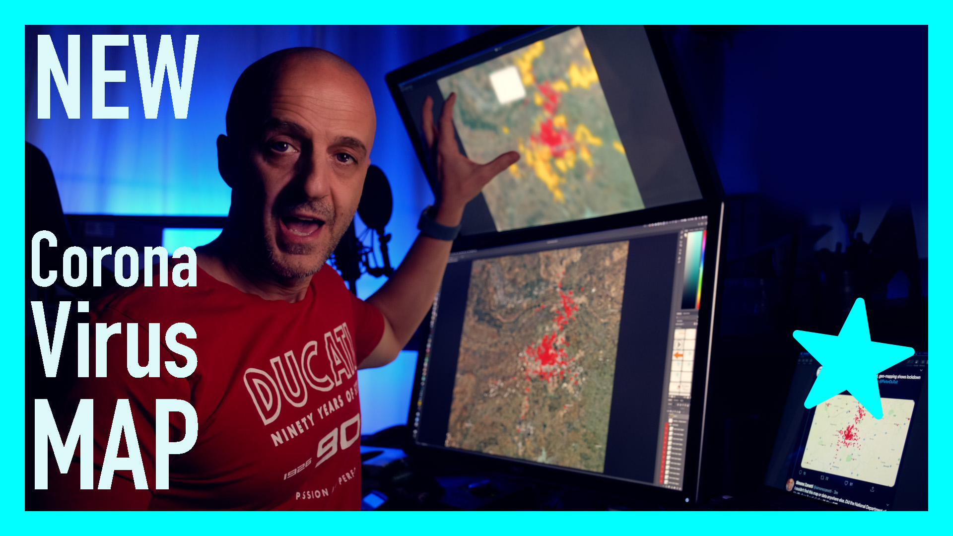
Data transparency is essential when fighting a pandemic, especially the geo-location of the positive cases. South Africa took a great step in this direction on the 10th of April 2020 when they shared a screenshot of the location of the Covid-19 positive patients in the country.
(You can watch the recorded live episode here below)
Unfortunately, this was the only step in that direction… until now.
Here below, you see a map published by CSIR (Council for Scientific and Industrial Research) which is teaming up with the South African government to fight the Covid-19 spread.
In the map you can zoom into a specific area and see the risk level of that specific zone. The smaller the dot, the less the risk, the hotter the colour of the dot, the riskier is the area (Also, smaller dots = less risk, bigger dots = higher risks).
I couldn’t find the criteria they used to determine the risk.
A screenshot map
Let’s go back to the geo-map of 1082 Coronavirus cases in SA (here below) showing cases in the Gauteng province. (Data from the 10th of April, 2020)

Source – National Department of Health presentation to Parliamentary health portfolio committee, 10 April 2020.
There are a few things that are stage about this map:
-
Only News24 published an article of this. See here the original article and then others copied from that article
-
Apparently, the government presented only a screenshot and not the full data-set, according to a News24 journalist that was present and was kind enough to answer to my questions
-
There is no indication of what the dots represent. Is it the physical address of the person resulted positive? Is it the clinic where they have been tested?
My interpretation
So I decided to overlap the dots on a bigger map, here it is.

Even in this format, the map doesn’t provide extra information, except for a bit more details if you zoom in, like in the example below.

Then I tried to overlap the hospitals (I couldn’t find the map of the clinics) to see if the dots were closer to the hospitals where the tests were performed, but it doesn’t look like it, see below.

The hospitals are the green icons. Source: google maps.
The revelation map
Then I found a map from BusinessTech.co.za with the unemployment rate in Gauteng and, most importantly, the townships in Gauteng.

The map from BusinessTech.co.za
I adjusted the colours and shape of the townships, trying to follow the geographic boundaries from Google Earth, and I overlapped the map to the previous one and… voilà!

Gauteng Province, South Africa: Coronavirus cases in red and townships in yellow by SimoneZanetti.com
What do you see?
The first thing that is evident from the map is that there are almost no red dots in the townships.
How do you explain that?
-
Very few tests have been performed in the townships, which are the areas with higher risk, according to the CSIR map above.
-
People from the townships are tested in clinics outside of the townships
-
People in townships are tested with mobile unites but not reported
-
Other options? Let me know in the comments
I did a live stream on this subject on Saturday the 18th of April 2020, you can watch it here.

Social Selling: fad or cash cow?
And what is “Social Selling” in the first place? Can we really generate more leads and sales with it? Well, yes you can and you will after you read this article or watch the following video.
Featured Publications
Articles
- Lorem ipsum dolor sit amet consectetur adipiscing elit. Divi Corner
- Phasellus malesuada nibh quam A congue ante ultricies sit amet Extra Space
- Maecenas ante mauris, placerat in pretium non, sagittis a leo. Bloom Post
- Nulla feugiat ipsum facilisis finibus ornare. Monarch Daily
- Donec placerat bibendum purus ac volutpat. Nexus Magazine
Wellness Book Series
- Part 1 – Ipsum dolor sit amet consectetur adipiscing elit
- Part 2 – Phasellus malesuada nibh
- Part 3 – Feugiat ipsum facilisis finibus ornare.


0 Comments